Showing posts with label cover art. Show all posts

Thursday, July 11, 2013

59th Post!


It's been a little while since I've posted an update. sorry about that! I've been a little busy wrapping up the third issue of Brandi Bare. Which, if you were part of the Kickstarter campaign, you've already had a chance to read.  The digital version at least, the printed version is currently being...printed.

so here's a few pieces of art from the comic.

regular cover version:


and the exclusive cover for the Kickstarter supporters:
 and here's some other stuff the Kickstarter backers will be getting...
These postcards were one of the stretch goals we hit while the campaign was running. Just got them
back from the printer.


Saturday, May 25, 2013

55th Post!

I saw that one of my recent cover for Zenescope is online now. for
Grimm Fairy Tales Presents Demons: The Unseen #3 (which will be available in August)


First up, the digital rough sketches. the circled one is the one they chose.  These were done in photoshop.
next up finished pencils...

and then digital colors (Painter and Photoshop)
-Joe


Thursday, September 6, 2012

22nd Post!

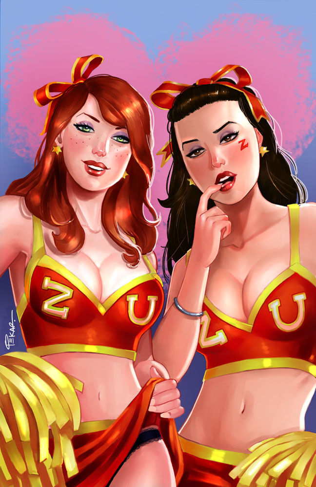
Cover for Zenescope's 'Irresistible #2'. This is their exclusive Baltimore Comic Con cover. So if you're at the show, pick it up! :)


And here's the process for those interested...

First up (as always) are the thumbnails (drawn in photoshop). The general idea of the cover was two cheerleaders looking seductively at you (the viewer).
Then I did a cleaned up sketch (still using only Photoshop).
Next up are the pencils (blue, red and purple col-erase).
(I was asked to change the brunette's hand position before I got to the pencil stage...that's why I do the cleaned up digital sketch. It's always easier to make changes there as opposed to erasing the pencils and redrawing.)

It was here that I also decided to change the logos to just 'Z' and 'U' instead of Zen U...(for Zenescope University of course!). After looking thru tons of cheerleader uniforms for reference (life is rough ;)) it seemed the simpler the logo the better.

Then I started the colors in photoshop, and here's a few in progress shots...
It was here that I figured I should change the colors of the uniforms to red instead of green. The red will pop the girls out a bit more...warm colors (like the red) move forward, cold colors (the green) recede. Even though I still like the girls in the green personally ;)


Tuesday, August 14, 2012

19th Post!

This is an upcoming cover for Zenescope's Halloween issue. (It's already been shown in Previews for this month so I figured I'd post it here.)

and here's some progress shots...first up, digital layouts (in Photoshop)
as you can see by the final up above, it was decided to go with 'B' (just flipped Alice to the pose she had in 'A')
Then I went in and did a cleaned up sketch in photoshop...still all digital at this point)
Then (and if you've followed my other posts, you know what's next...) I printed it out and traced the art onto 11x17 bristol paper. Drawn with my favorite col-erase pencils (blue, red and purple).
After this point it's scanned and I start coloring in Photoshop and Painter. And if you're wondering why I use col-erase pencils (I may have mentioned this in earlier posts...I use the pencil colors with my digital coloring...I'll blend the reds in the pencils with the colors I choose for the skin tones, blue in the blacks, etc. plus I like the original art to have some color to it, rather than just gray graphite.)

Here's a few progress shots of the digital coloring...

At this point I'm still in photoshop just blocking in some colors here and there and... 'rounding out' other areas (so to speak :))
and by this point I've got their cleavage all set! So I'm pretty much done at this point, right? (Don't judge me, I work on my favorite parts first ;))
moving along...and now going back and forth between Photoshop and Painter.
All of the colors are pretty much set now, it's just time for fine tuning everything.
As you can see, there's not much difference between this image and the final up top. just some minor adjustments here and there. (plus adding the much needed highlights to their chests ;))

And there we have it...Happy (early) Halloween or as I like to call this cover 'Trick or Teat'. Hope you enjoyed seeing the process.