Monday, September 24, 2012

25th Post!

The Stereotypical Freaks...

This is what I spent a lot of 2011 and 2012 working on. The Stereotypical Freaks is a 140 page graphic novel written by Howard Shapiro and drawn by me, with lettering by Ed Brisson.

It will be available Nov. 14th at amazon.com and other book shops/comic shops.

It's a story about 4 high school students that form a band to take part in their school's Battle of the Bands. The story actually goes beyond that as one of the characters gets some news that changes everyone's lives. (I really enjoyed reading the story as I worked on it...so if nothing else, pick it up because it's a great read.)

Here's the cover image (with and without logo. Drawn and colored by me.)

The following are a few examples of pages from the book.


So there's a peek at the story and art (and lettering!) for the book.

You can pre-order it on Amazon.com right now.

(Oh, and if you do pre-order it you'll get a limited edition poster and bookmark...so if you do pre-order, send an email to: hockeyplayer4life@gmail.com  and let them know you pre-ordered and they'll get you taken care of :))

Hope you enjoy the book when it comes out...it's the largest comics related project I've worked on to date and it was a ton of fun.

Monday, September 17, 2012

24th Post!

So what's with the cowgirl I've been drawing lately?

I've drawn her a few times over the years, and always wanted to do more with her (she's fun to draw!). A few older images are on my Deviant Art page.
Early Drawing
Slightly more 'realistic' version

Lately I've been working on the 3rd issue of my Brandi Bare comic, but I've gotten sidetracked with another story I've wanted to do with this cowgirl.

It's all still in the early stages of development but I thought it would be fun to post progress images as it comes together.

Now, I had to draw the back of her costume for once, right? ;)

 And this is one of the supporting characters. Because I needed a reason to draw more geisha girls :)
All the images I've drawn for the cowgirl have been digitally colored so far. I wanted to try my hand at a watercolor version of her.
This was a photo because my scanner can't handle those shades of pink and purple that I love, as it tends to wash out those bright colors.

hope you enjoy the peek into my process.

-Joe

Friday, September 14, 2012

23rd Post!

Cowgirl time!

I've always liked drawing cowgirls...loved cowboy movies as a kid. I watched any and all John Wayne and Clint Eastwood movies I could find on tv, but once I saw The Wild Bunch when I was a little older, that solidified Westerns as my favorite genre for years. So whenever I get a chance (or think to) draw a cowgirl, I like to have fun with it.

Here's a few images for a little project I'm hoping to keep running with. (fingers crossed knowing my attention span).
 and a close up just for fun.
 In the next sketch I decided to give her a real horse, just because it's been ages since I've drawn one and could use the practice :)
 I may not stick with these colors for the horse...we'll see how it goes.
Just thought I'd post a few in the hopes that it'll keep me motivated to keep going with this and develop it further.

anyway, hope you like what you see :)

(and these were drawn then scanned and then digitally colored in Photoshop)

Thursday, September 6, 2012

22nd Post!

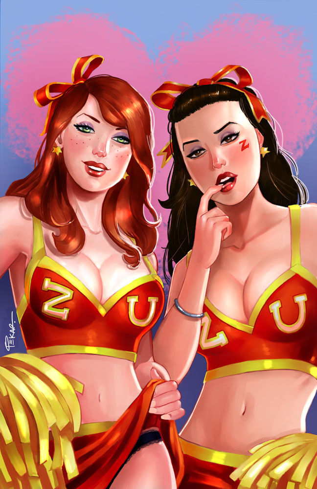
Cover for Zenescope's 'Irresistible #2'. This is their exclusive Baltimore Comic Con cover. So if you're at the show, pick it up! :)


And here's the process for those interested...

First up (as always) are the thumbnails (drawn in photoshop). The general idea of the cover was two cheerleaders looking seductively at you (the viewer).
Then I did a cleaned up sketch (still using only Photoshop).
Next up are the pencils (blue, red and purple col-erase).
(I was asked to change the brunette's hand position before I got to the pencil stage...that's why I do the cleaned up digital sketch. It's always easier to make changes there as opposed to erasing the pencils and redrawing.)

It was here that I also decided to change the logos to just 'Z' and 'U' instead of Zen U...(for Zenescope University of course!). After looking thru tons of cheerleader uniforms for reference (life is rough ;)) it seemed the simpler the logo the better.

Then I started the colors in photoshop, and here's a few in progress shots...
It was here that I figured I should change the colors of the uniforms to red instead of green. The red will pop the girls out a bit more...warm colors (like the red) move forward, cold colors (the green) recede. Even though I still like the girls in the green personally ;)


Tuesday, August 28, 2012

21st Post!

Thought I'd post some new art...

first up a couple commissions...

Princess Jun from Gatchaman (first time drawing her)
and John Carters' gal Dejah Thoris....
Both were on 11"x17" bristol, using Copic Markers and watercolors.

and here's a preview of my cards for Bad Axe Studios 'Bombshells: Women of War' sketch card set.
Not sure when they'll be out, but I'll post the rest when I can. Enjoy for now :)


Wednesday, August 22, 2012

20th Post!

Here's a Lady Blackhawk (from DC comics) commission.

11"x17" bristol paper, with copic markers and watercolors for the background.

Started with a few sketch ideas...(drawn in photoshop)
We decided to go with B (though it was a tough choice between B and C...which I still may draw someday). Why does she have an MP-40? just because it's a cool looking gun :) and will easily give it that WW2 era feel.

Next up is the tightened up digital pencils...(still in photoshop)
Then it's printed out and traced onto the 11x17 paper...
(and if you've been following my other posts, you know I love my  col-erase pencils.)

From here I decided to ink the skin tones (with a light brown Faber-Castell pen) and inked her uniform with a black Micron pen (01 and 08 thickness)

Then I break out the copics...

and then used watercolors for the loose feel of clouds and sky to help separate the background from the tight rendering on her. (scroll up top to see the finished piece :))

-Joe

Tuesday, August 14, 2012

19th Post!

This is an upcoming cover for Zenescope's Halloween issue. (It's already been shown in Previews for this month so I figured I'd post it here.)

and here's some progress shots...first up, digital layouts (in Photoshop)
as you can see by the final up above, it was decided to go with 'B' (just flipped Alice to the pose she had in 'A')
Then I went in and did a cleaned up sketch in photoshop...still all digital at this point)
Then (and if you've followed my other posts, you know what's next...) I printed it out and traced the art onto 11x17 bristol paper. Drawn with my favorite col-erase pencils (blue, red and purple).
After this point it's scanned and I start coloring in Photoshop and Painter. And if you're wondering why I use col-erase pencils (I may have mentioned this in earlier posts...I use the pencil colors with my digital coloring...I'll blend the reds in the pencils with the colors I choose for the skin tones, blue in the blacks, etc. plus I like the original art to have some color to it, rather than just gray graphite.)

Here's a few progress shots of the digital coloring...

At this point I'm still in photoshop just blocking in some colors here and there and... 'rounding out' other areas (so to speak :))
and by this point I've got their cleavage all set! So I'm pretty much done at this point, right? (Don't judge me, I work on my favorite parts first ;))
moving along...and now going back and forth between Photoshop and Painter.
All of the colors are pretty much set now, it's just time for fine tuning everything.
As you can see, there's not much difference between this image and the final up top. just some minor adjustments here and there. (plus adding the much needed highlights to their chests ;))

And there we have it...Happy (early) Halloween or as I like to call this cover 'Trick or Teat'. Hope you enjoyed seeing the process.